How to Edit a Button

Buttons provide basic navigation and selection functions throughout each App. This tutorial describes how to create, delete and re-order buttons on a selected page.
For information on how to change the appearance and function of buttons, go to Using the Element Editor.
Step 1 |
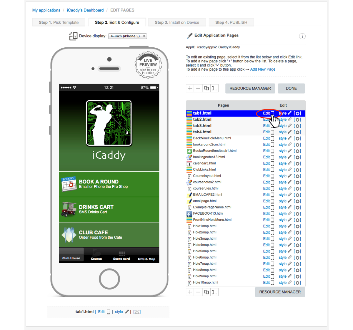
From the 'Edit Application Pages' screen, select the page that contains the 'button' you wish to edit. Click 'Edit' as shown above.
|
Step 2 |
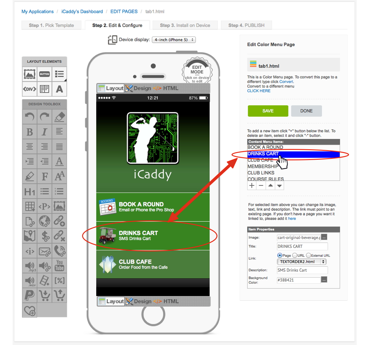
Content Menu Items Toolbox. The selected page will open for editing as shown above. The 'Content Menu Items' list contains each 'button' on the selected page. Each button listed has a corresponding button shown on the 'handset display'. Choose the specific button you wish edit from the 'Content Menu Items' list. In this example, we are selecting the 'DRINKS CART' button. Note: The 'Content Menu Items' toolbox provides three separate functions. Each function is described separately below. |
'Content Menu Items' - Function 1 |
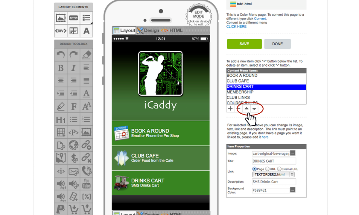
Button Order. After selecting the desired button in Step 2, click the 'up-arrow' or 'down-arrow' symbols (located below the 'Content Menu Items' toolbox) to move the selected button up or down the button list.
Note: Changing the order of the buttons here will change the order they are displayed on the 'handset display'. Make sure 'Layout' is selected on the 'handset display' to view changes. |
'Content Menu Items' - Function 2 |

Delete a Buttton. Delete a selected button by clicking the 'minus' icon (-). If you accidentally delete a button, do not click 'SAVE'. Click 'DONE' and then click 'Cancel' to ensure page modifications are not saved.
|
'Content Menu Items' - Function 3 |
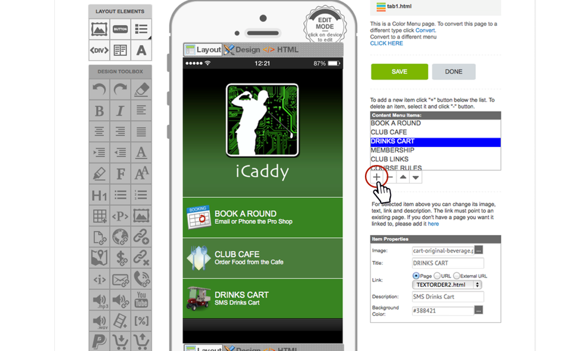
Add a Button. You can add a new button to the page by selecting the 'plus' icon (+).
|
Step 3 |
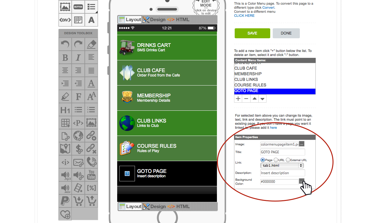
Item Properties Toolbox. After selecting the desired 'button' from the 'Content Menu Items' toolbox, the 'Item Properties' toolbox allows you to edit different 'properties' for the selected button. These properties allow you to customize the button's look and function. Each property is discussed separately below.
The 'Item Properties' fields can be edited in any order. The first 'property' we are going to discuss is the 'Background Colour'. In the example shown above, we are going to change the 'Background Color' of a newly created button (default name: 'GOTO PAGE' / default colour: black). To edit this property, click on the grey button on the right of the 'Background Color' field (as shown above).
Note: Please be aware that the fields indicated in the 'Item Properties' toolbox vary depending on the button type selected. The iCaddy range of App templates contain different button types, so the property fields indicated above may vary, depending on the App template chosen. |
'Item Properties' - Background Colour |
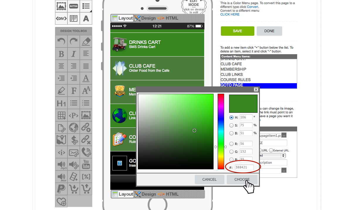
Background Color. After clicking on the grey button described in Step 3, the 'Colour Palette' toolbox (shown above) will appear.
The 'Colour Palette' toolbox allows you to customize the button's background colour in many ways. a. Change the vertical position of the 'colour spectrum' slider (rainbow) to choose the general colour. The colour of the palette on the left side of the toolbox will change accordingly. The palette includes various 'shades' of the colour selected on the slider. Click on the palette to select the specific colour for the button. Note: The specific selected colour corresponds with a specific 'Color Code' (circled above). Click 'CHOOSE'. b. You can manually set the 'Color Code', or customize your own color by changing the Hue (H), Saturation (S), Brightness (B) settings, or the Red (R), Green (G), Blue (B) balance fields to suit. Note: The simplest way to match the colour of a new button to the colour of an existing button, is to note the 'Colour Code' (e.g. #000000)' of the exiting button and insert the same 'Colour Code' in the 'Background Colour' field in the 'Item Properties' toolbox for the new button. |
'Item Properties' - Image |
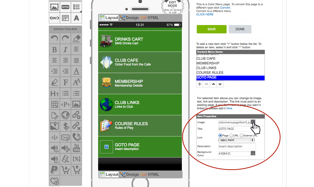
To change an 'image' depicted on the selected button, first click the grey button on the right of the 'Image' field (in the 'Item Properties' toolbox) as shown above.
The 'RESOURCE MANAGER' will open (as shown below). In this example, we are going to change the image of the 'GOTO PAGE' button (previously selected). |
'Item Properties' - Image (continued) |
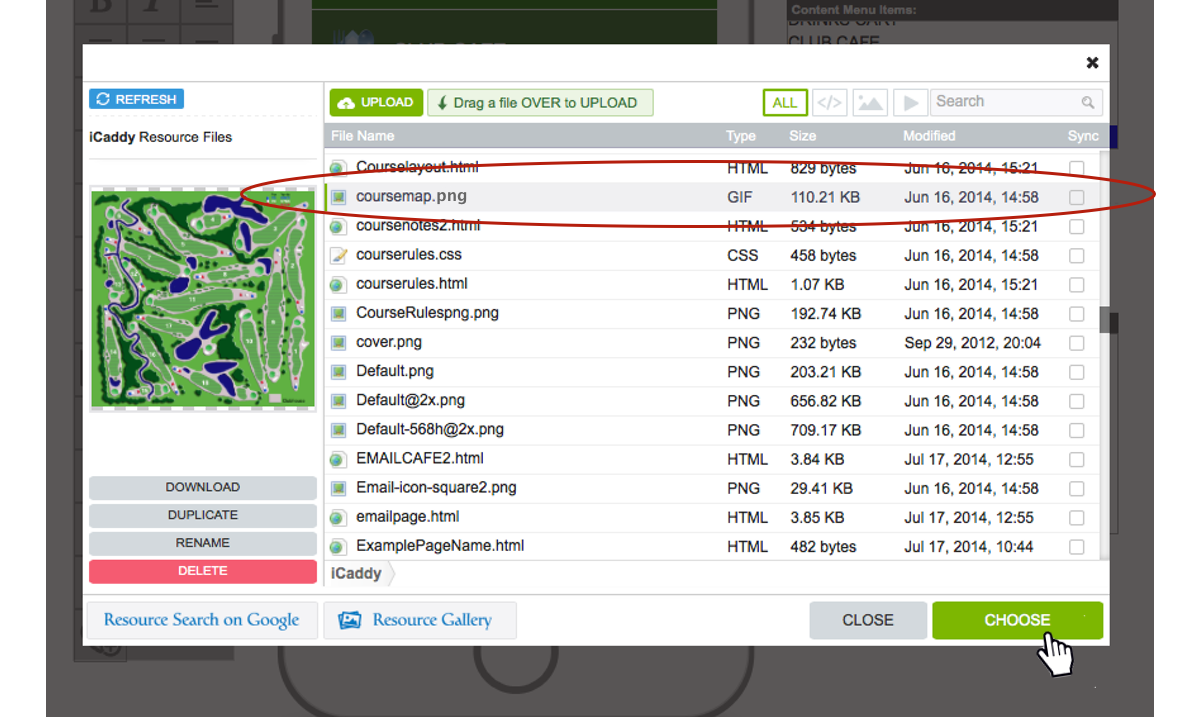
Select the desired image file (or upload a new image file as required).
Click 'CHOOSE'. Note: Use the same process above to change the 'image' on an existing button. For further information on adding an image to your App go to How to Add a File to 'In-App Resources'. |
'Item Properties' - Title & Description |
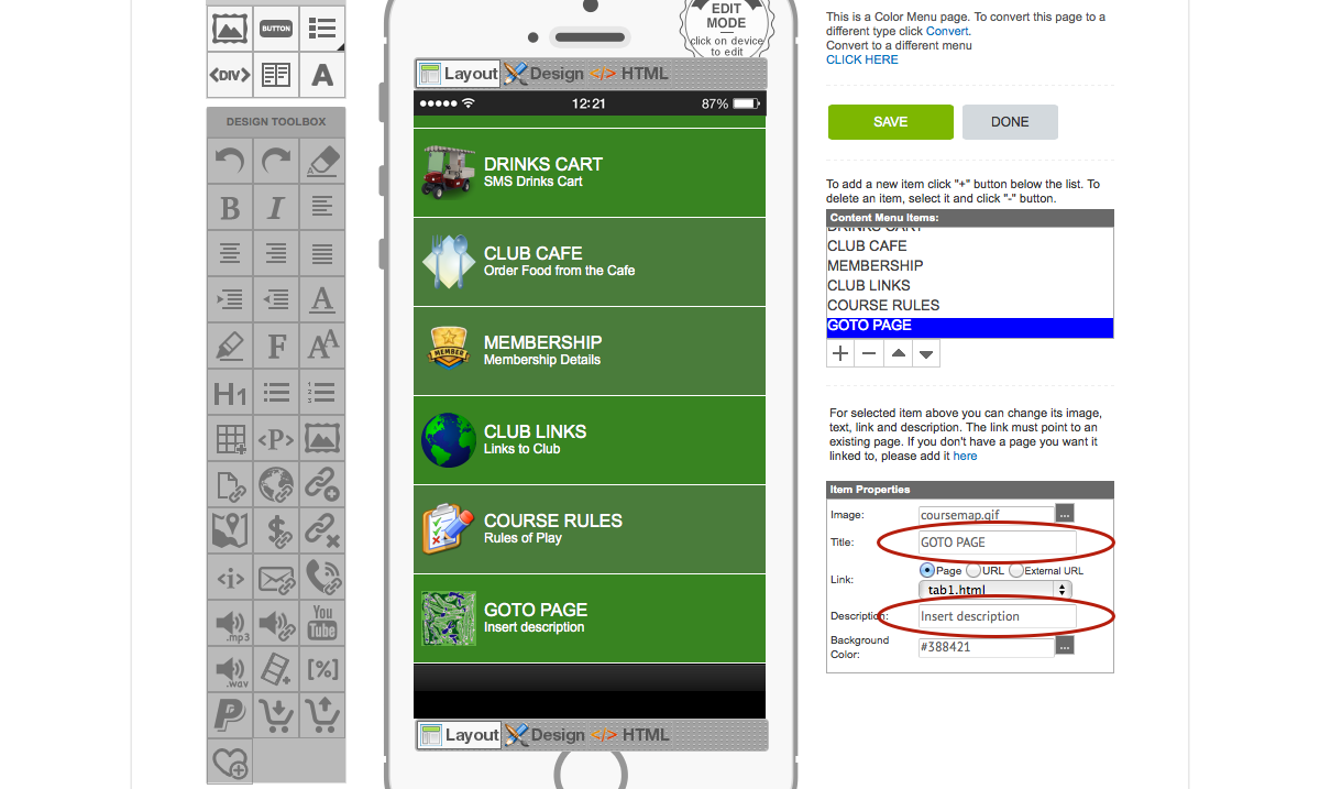
Title. Enter the 'Title' for the button (e.g. GOTO PAGE) in the 'Title' field. Description. Enter a 'Description' for the button in the 'Description' field. The button 'Description' is optional and can be left blank if preferred. |
'Item Properties' - Link |
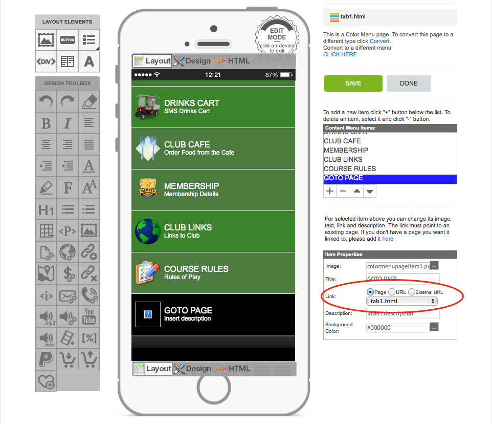
Link. The 'Link' property has three different options available. You can 'link' the button to another 'Page' in your App, or to a 'URL', or to an 'External URL' (these options are circled above).
Note: Most buttons featured in iCaddy Apps only allow the 'Page' link option, however you can still link a button to a URL, an External URL, or other link types, by editing the same button using the 'Element Editor' on the page where the button is located. For instructions on how to use the 'Element Editor', go to Using the Element Editor. Once all the desired button properties have been edited, click 'SAVE' to apply changes. You can click 'SAVE' at any stage and return to finish later. After editing a button, you can check the changes on your device using the iCaddy Apps Previewer. Refer to How to Download the iCaddy Apps Previewer and How to View Your App on the iCaddy Apps Previewer, for further information. |
